.

Typography Of Track and Field

00:00

About this episode:

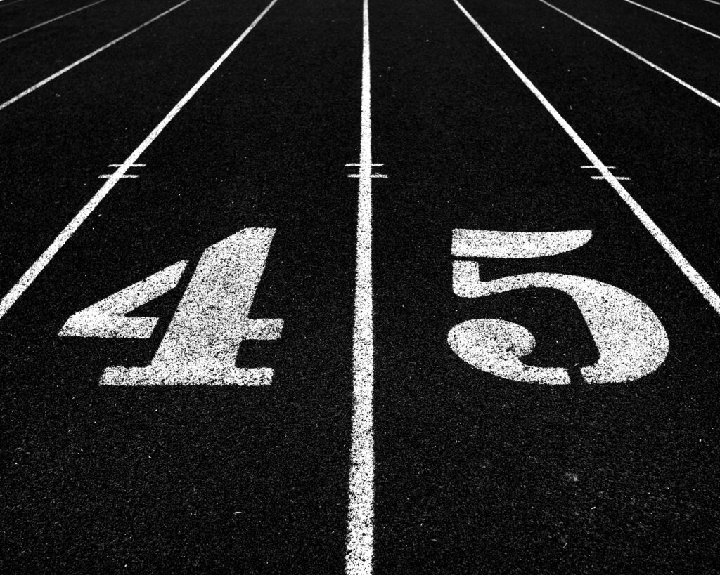
Typography is what language looks like. When you think of “track and field,” what font do you see the sport in? What does the design of the sport say about the content it creates and the ways in which it is trying to grow?

I reached out to Joe Bosack, the president of an award-winning design studio specializing in sports, higher education, and entertainment. He is responsible for redesigning the Heisman logo and creating the Centennial icon for the Jackie Robinson Foundation. We discuss how font plays a role in inclusivity for women and how industries can build a better narrative for women through design.

Do you believe the type?! Join us!

About Unexpected Curves:

A unique listening experience for the next generation of sports fans to interact with the stories about the people, and the plays that make an industry. In each episode we will get into the culture of women’s sports. Breaking down what’s good, what’s bad and what’s weird. We’ll hear from athletes and experts paving the way for future and sometimes we will go back in time to see how we got here in the first place.

This is the sports show where we give the girls some support.

Listen to Unexpected Curves on these podcast providers

Subscribe To The Newsletter

Join The Stack, your weekly email on running culture

Thank you for subscribing!

Something went wrong. Please try again.