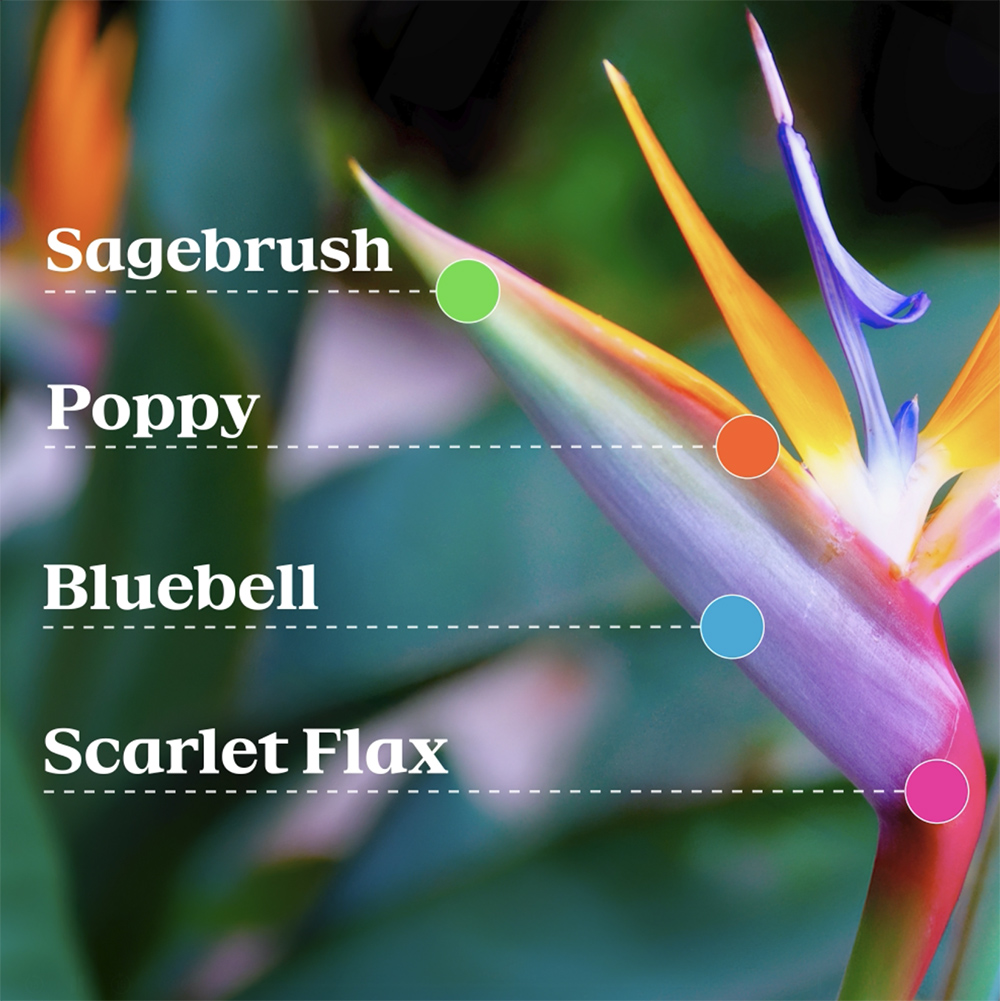
The 2028 Los Angeles Olympics are still more than two years away but the Games now has its signature look as the Superbloom that will be featured on every piece of signage, in venues and on promotional materials.
LA28 organizers announced the official shift to the new branding and identity on Monday that is said to be inspired by the natural phenomena that transforms regions throughout Southern California with colorful flowers.
The design scheme will accompany all materials related to the LA28 Olympic and Paralympic Games and come in the form of 13 distinct designs, looped animations and specific type faces unique to both events.
“The Superbloom mirrors the spirit of the Olympic and Paralympic Games,” Ric Edwards, LA28 vice president of brand design and executive design director said. “Athletes train their entire lives for a moment on the greatest stage in sports. When the conditions are right, everything comes together and something extraordinary happens. That feeling of anticipation, energy and the culmination of the many moments that led them here is what inspired our Look of the Games.”
Each Olympic cycle is an opportunity for organizing committees to craft unmistakable logos and imagery, with Tokyo (1964), Mexico (1968) and Munich (1972) among the most memorable branding efforts that have inched into cultural landmarks decades after their respective Games.
“We wanted the Look to feel like Los Angeles itself,” Geoff Engelhardt, LA28 head of brand design said. “LA is a city of incredible creativity, sitting at the intersection of sport and entertainment, and the Games will bring the world together here in 2028. By embracing abstraction and emotion, we created something people can interpret in their own way and see themselves reflected in.”
According to organizers, the design team studied past Olympic branding in detail for cues on how to lean on tradition and where to implement new concepts. The group ultimately decided to go with a completely independent idea that was presented to stakeholders months ago so the Superbloom theme would be easily adopted into promotional assets.
Meanwhile, the early unveiling will be an exercise in pushing a look that the designers hope can be synonymous with the Games over the next two years leading up to the opening ceremony. The official flower of L.A., The Bird of Paradise was particularly selected because of its widespread commonalty in Southern California in urban settings but also in deserts, valleys and cliffs via dormant wildflower seeds.
The use of an exact grid was chosen so the designs could be scaled on signs, large venue surfaces, paper tickets and credentials while easily being identifiable as part of character of the Games.